

Few months back, Google introduced the visual language, a single underlying system that allows for a unified experience across platforms and device sizes - Material Design. Since then, I’m following it and my mind enthusiastically forces me to develop something using it. While I was researching, I came across an open-sourced framework, materialize, which I think is the now most popular one among all. I started digging deep into it on Github and it really inspired me in kick-starting to develop. Finally, I decided to re-design my personal website on a whim, whose frontend was earlier coded using bootstrap3, now on top of Material Design. I introduced many new features like Kudoing blog-posts, Table of Contents & Read time for blog-post, side-navigation-bar, share selected text on Twitter, etc along with many improvements visually as well as technically.
Material Design’s perspective?
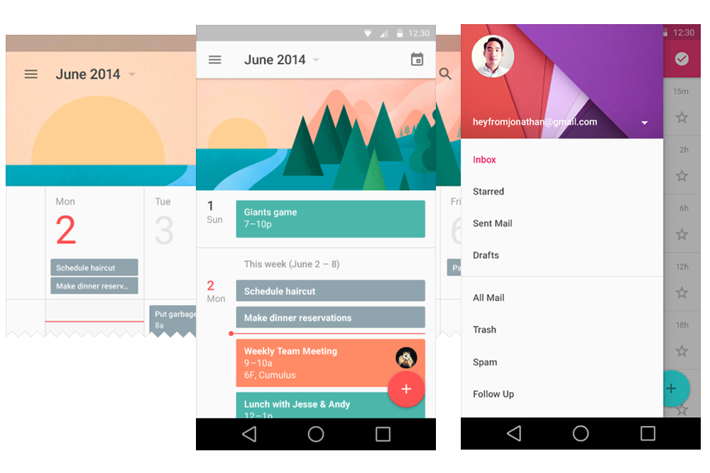
We worked together - Android, Chrome and across all of Google - to craft one consistent vision for mobile, desktop and beyond.
- Sundar Pichai, Senior Vice President
Material Design was introduced to change the User Experience by incorporating the classic principles of good design with the innovation. The designs are not just visually appealing but also convey the meaning aptly.
Getting my hands dirty
While my coffee was dipping off the mug, I was lucky enough to come across such a highly featured framework, materialize, where new features are still getting born. Please have a look at their official website once, the team has provided a nice demo of each such feature. Since, the project was in its early developement stages, I found some bugs and decided to contribute, submitted a small patch: fixing a small CSS issue. The world of open sourcing has taken a veer drift, seriously, and it’s worth mentioning here too :)
Here’s a list of features, the framework has the support for, and which I have implemented on my website:
- Full page Slider - on my Home Page
- Parallax plugin - on each node page, eg. blog, archive & projects
- Pushpin plugin - for Table of Contents in my blogs
- ScrollSpy plugin - again for Table of Contents in my blogs
- Pre-loader(spinner) - while parallax-image is being getting rendered
- Tooltips - wherever required
- Toasts - when someone kudos/unKodos my blogpost(similar to that of svbtle).
- Card Reveal- for displaying my projects’ report-card.
- Icons, buttons and waves - wherever they fit precisely.
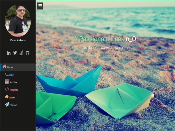
Alright! Hope it would have triggered the same adrenaline rush, what I experienced once :) Apart from rendering those tiny engaging pixels, I planned to implement some new features to my previously monotonic website.
- Floating left Sidebar for all-in-one routes for the whole site-walk, ensuring no distractness while reading stuff.
- Table of Contents in each blog for section-to-section jump.
- Inherited the way of giving Kudos as a means of liking/take-away-something from blog-post, exactly what svbtle-blog introduced. For this, I have used Firebase for storing, fetching and displaying the unique counts.
- Select the text which you like the most while reading blog and share it on twitter with just a single click and no time-loss.
- Automatically calculate and generate the read time for every blog-post.
- Changing Syntax highlighting theme to match the site’s theme, and to ensure better readibility.
I have proudly used hyde for generating my website. Read this post on Getting started with hyde to know more about it.
Good News - Showcase
I was more than lucky to get my site getting featured on the framework’s official site in showcase section. Also, Material Design Blog lists top five entries for Material Design inspirational websites, my being the first, yay! .
Previous blogpost Next blogpost